All Your Business Needs
I started out helping people and businesses in the local community, here in Central Virginia. Helping others disover their identity through their vision of their brand or scope of their project is very rewarding for me.
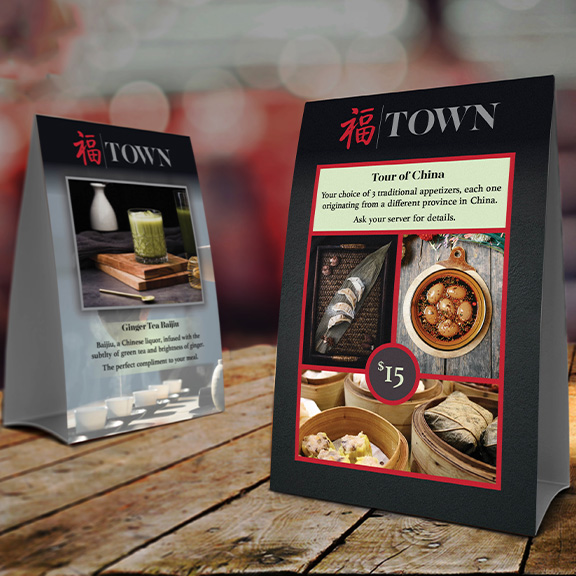
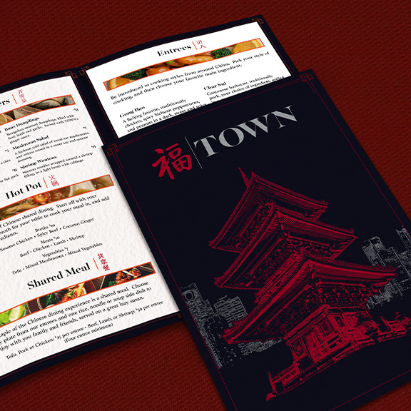
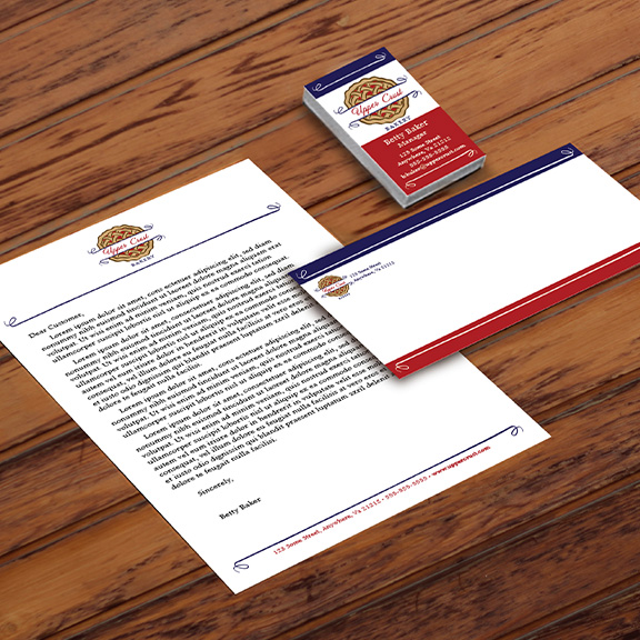
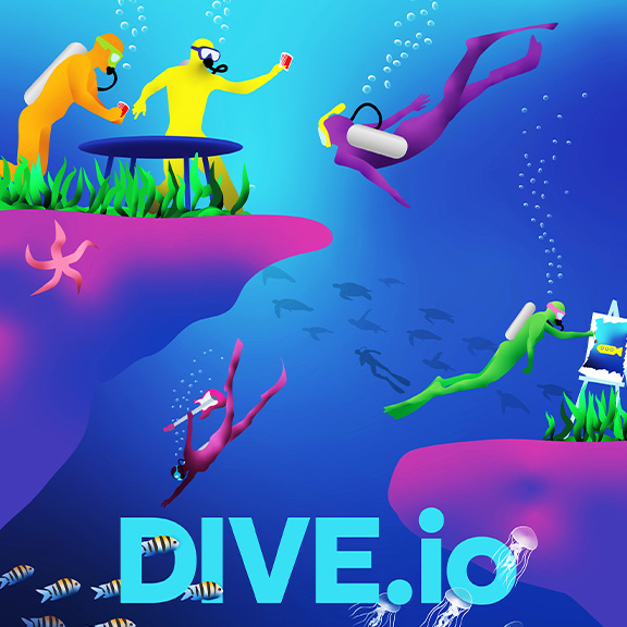
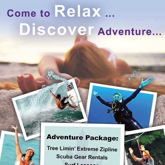
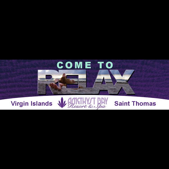
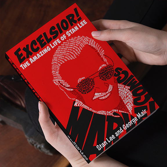
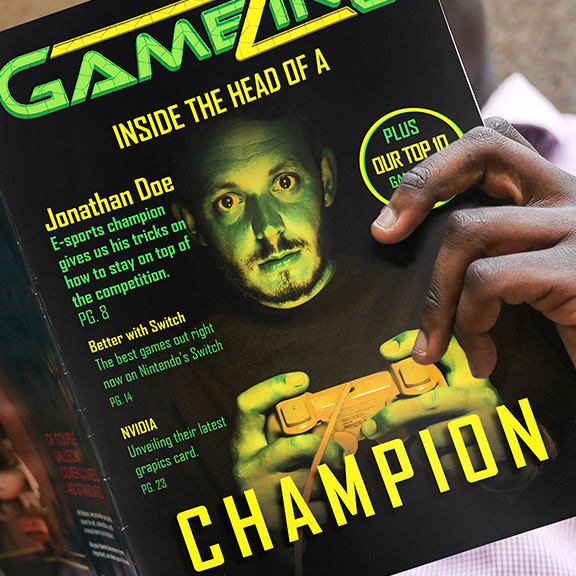
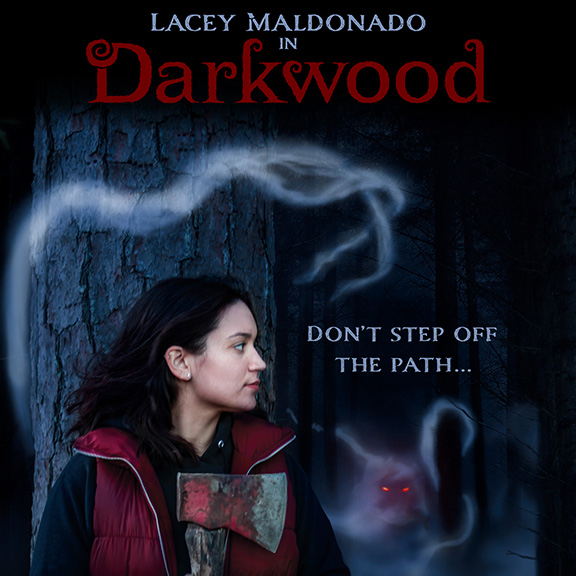
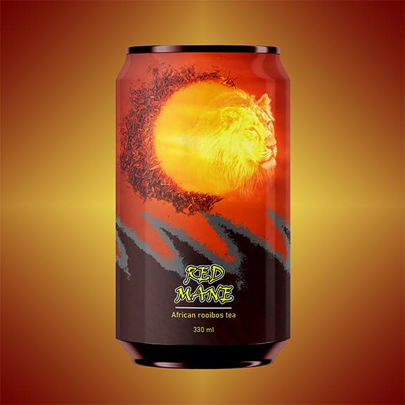
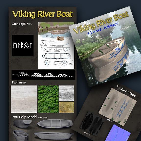
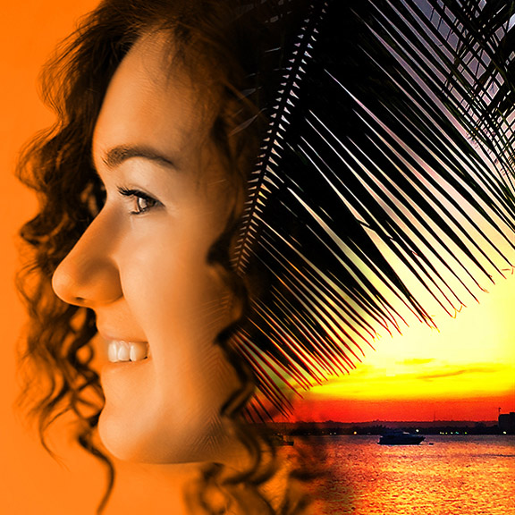
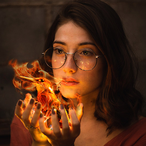
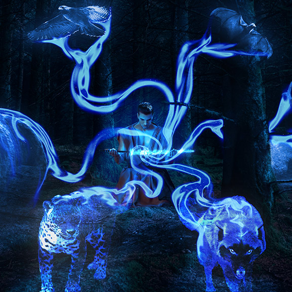
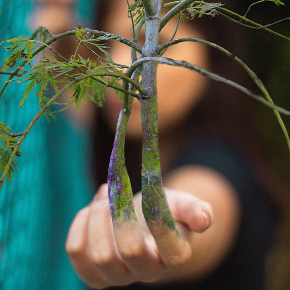
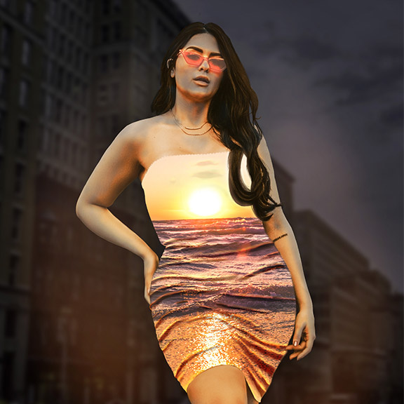
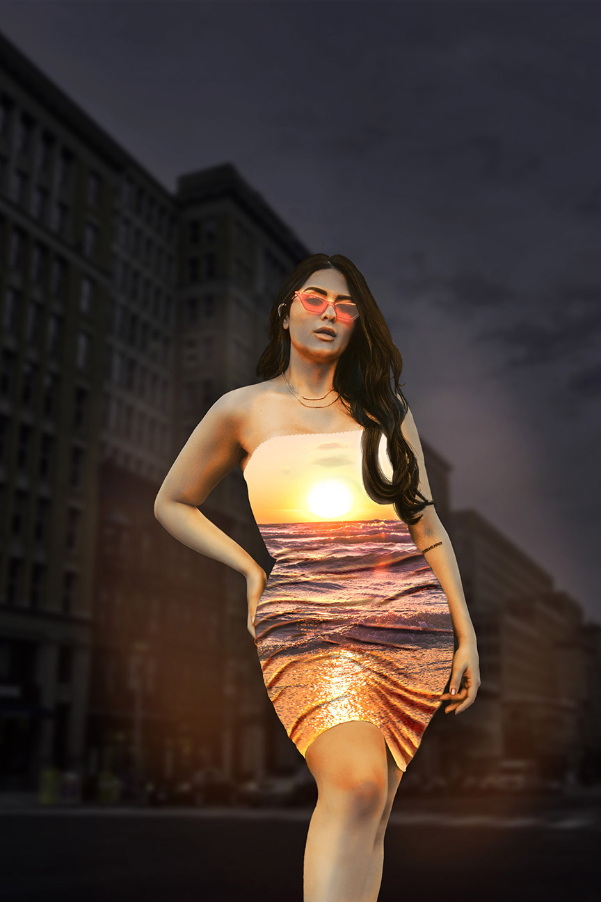
Photo Composites
When I created our tag line, creating reality from fantasy, this is what I was thinking of. Photo composites are a passion of mine. There is something magical about taking a real photograph of someone and transorming it into something extraordinary. I can help a person become the superhero (or villian) of their own story.
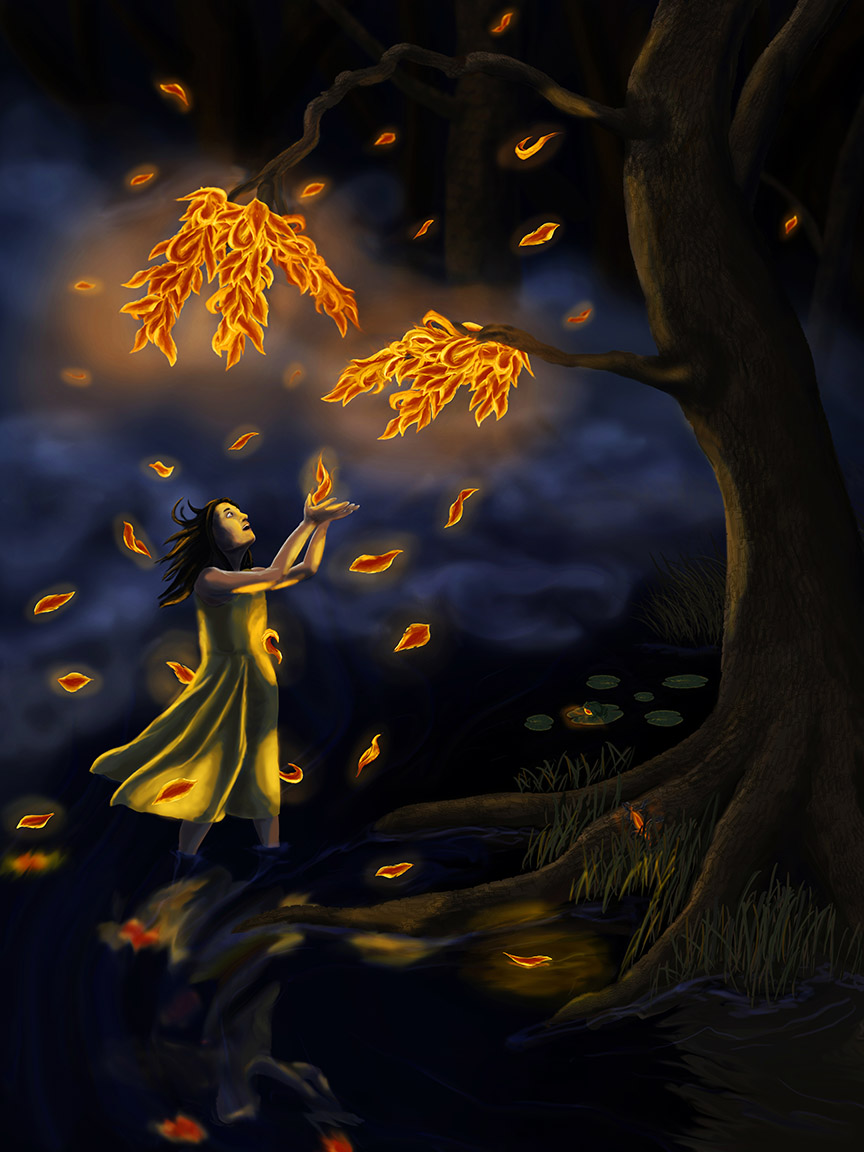
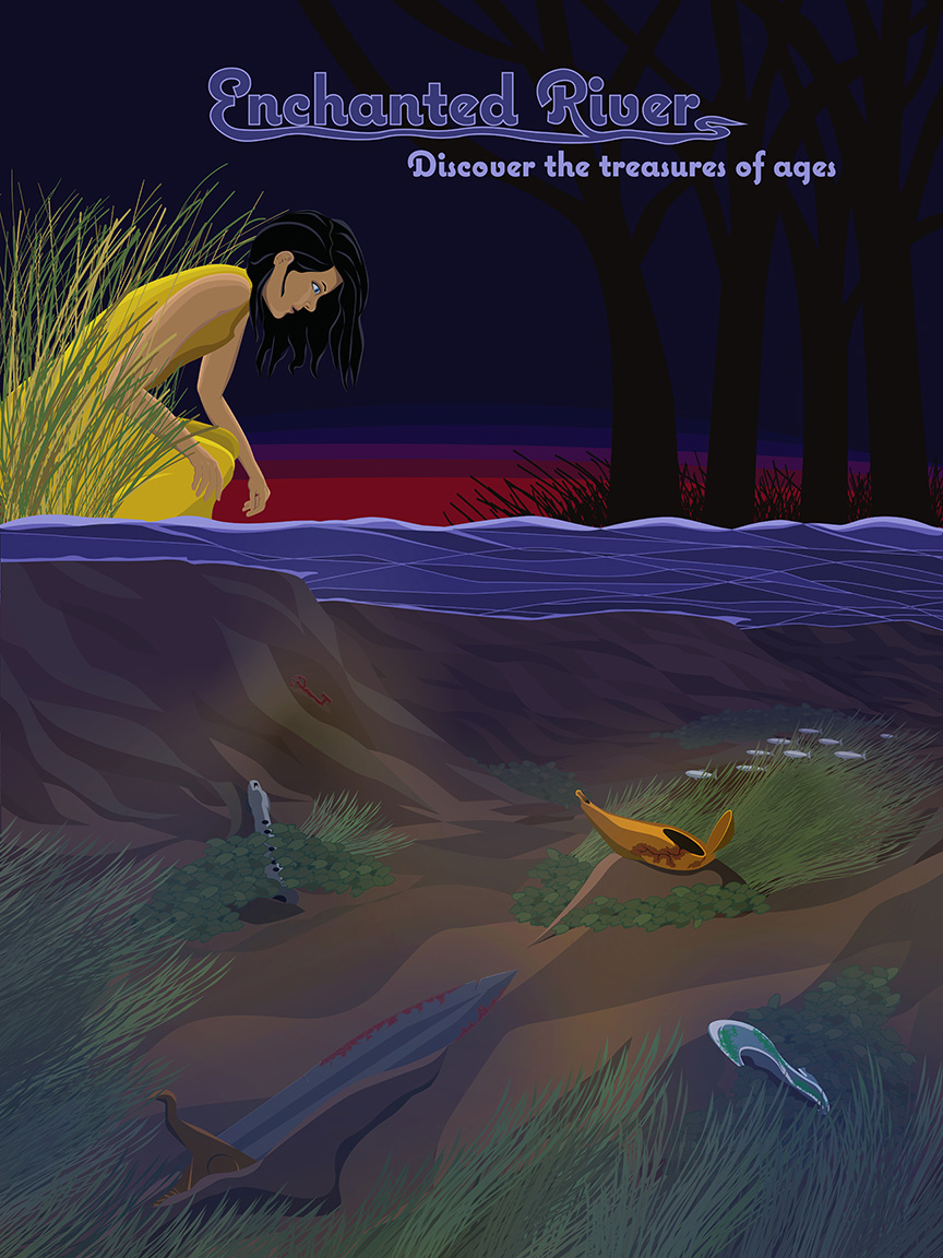
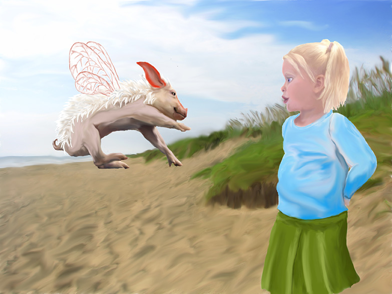
Illustration
Your imagination can take your mind anywhere, and I love creating images that I brainstorm up. The whole process, from thumbnail to finished product, helps breathe life into characters and stories I either love or dream up. Most of what I do now is digital painting, but I also have experience in traditional media, mostly oil pastel.
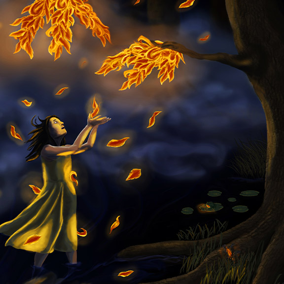
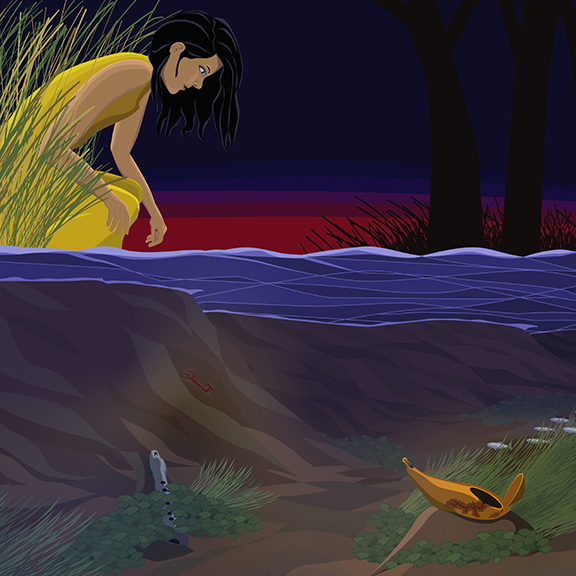
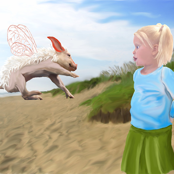
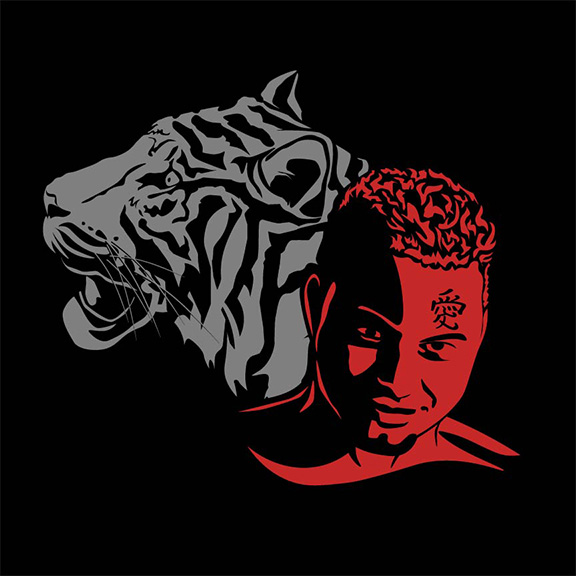
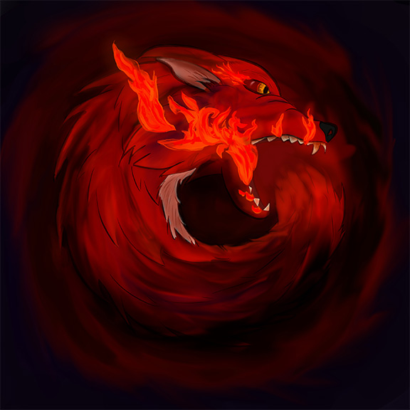
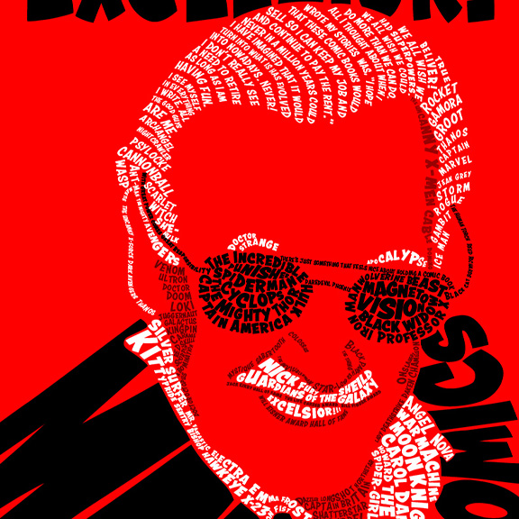
Photo Composites
Photo Composites
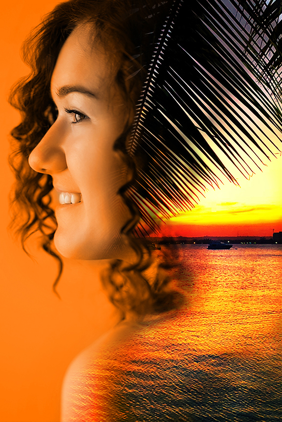
Photo Composites
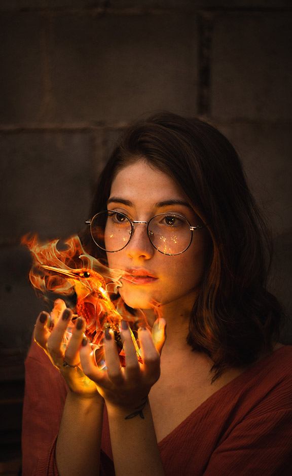
Photo Composites
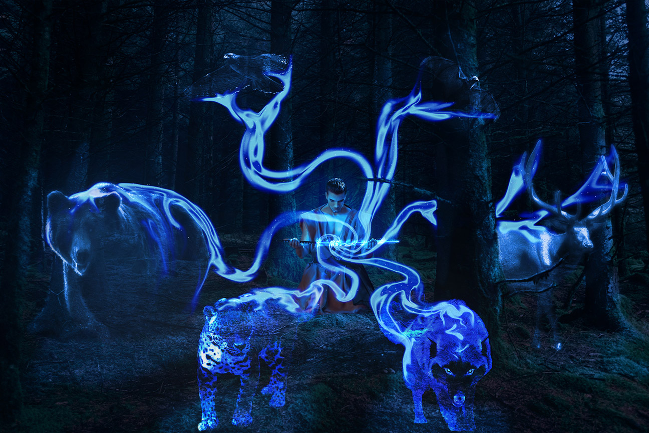
Photo Composites
Photo Composites
Illustration
Illustration
Illustration
Illustration

Illustration

Illustration
TOWN:
Table Tent
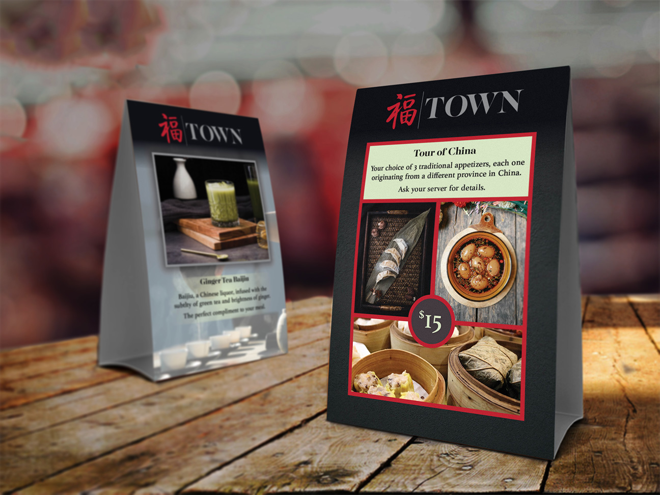
This table tent is a part of a project for TOWN, a restaurant that tries to strike a balance between traditional and modern Chinese cuisine. Provided with their logo and company chosen colors we created a simple, clean, balanced table tent to promote their special offerings.
TOWN:
Menu
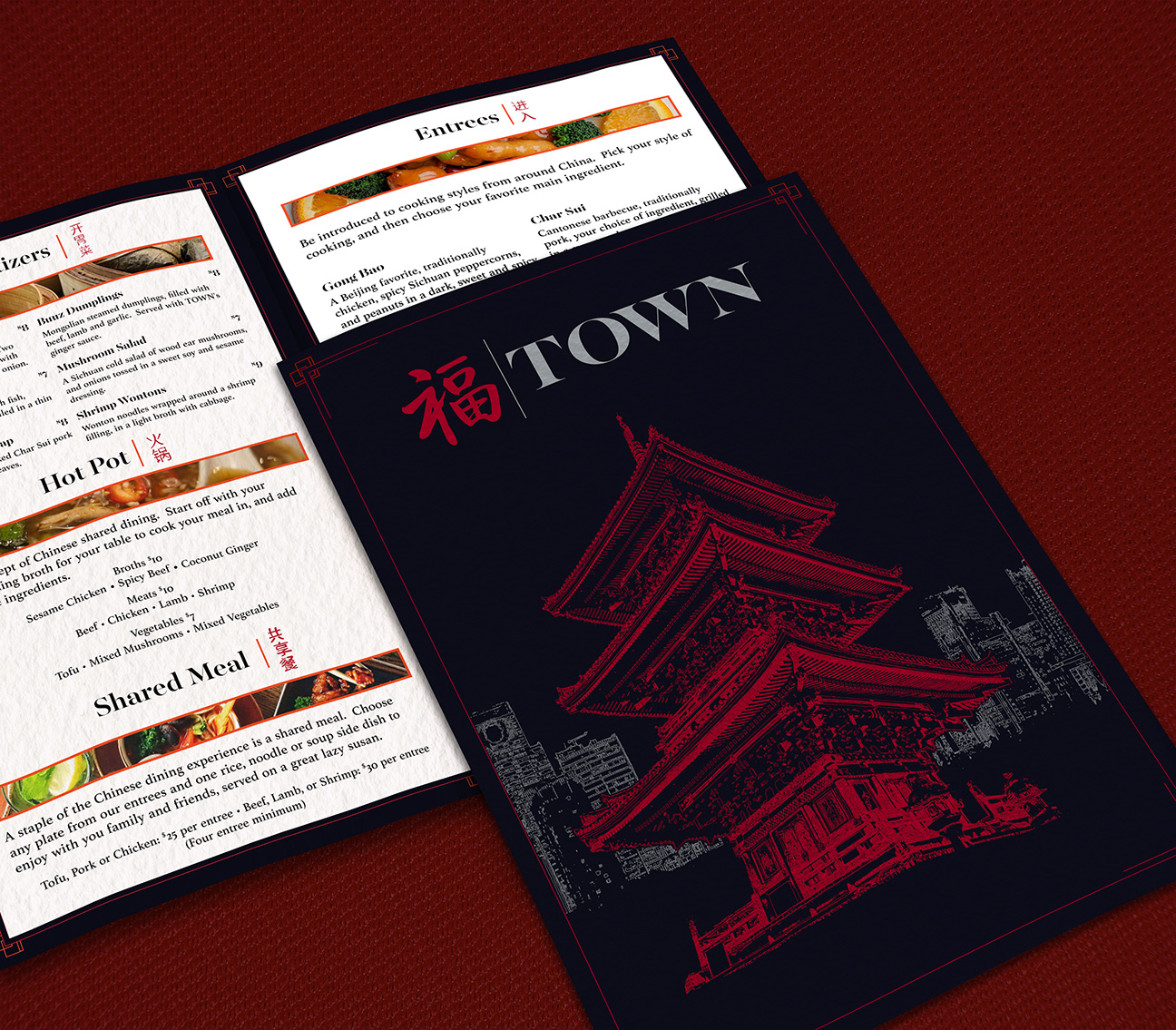
This menu is a part of a project for TOWN, a restaurant that tries to strike a balance between traditional and modern Chinese cuisine. Provided with their logo and company chosen colors we created a menu that combined traditional Chinese elements and combined them with a sleek modern design, this includes an illustration that depicts a traditional Chinese temple against the modern Shanghai skyline.
Upper Crust:
Stationery
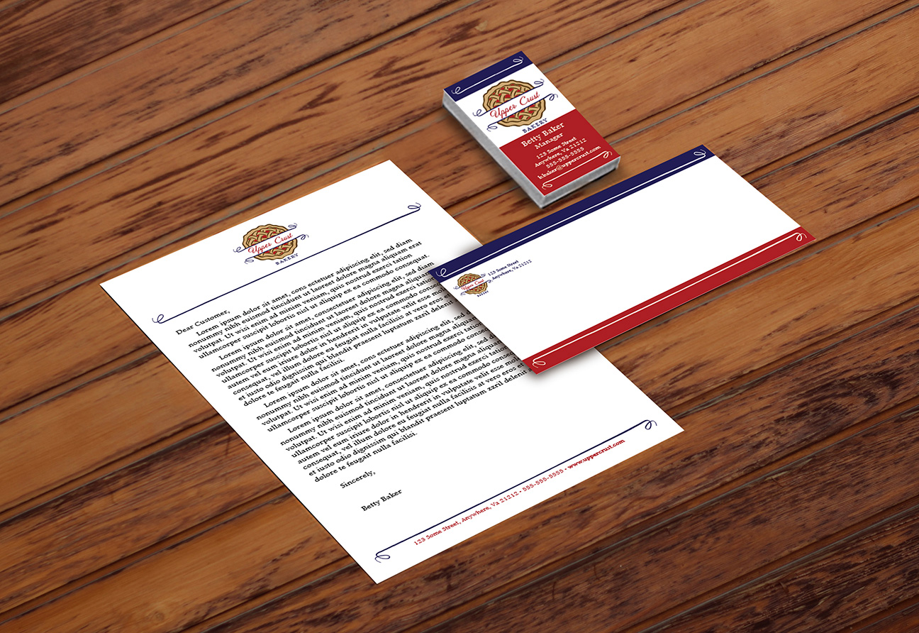
The Upper Crust Bakery stationery package was part of a project to create a branding package that includes creating a logo, and coming up with a branded business card, letterhead and envelope. We worked with client guidance to create branding that evoked a feeling of a rustic, traditional, French Bakery.
DIVE.io:
Digital Screen Ad
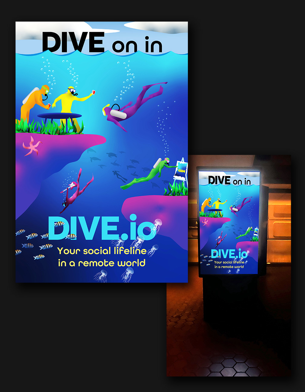
DIVE.io was a company that specialized in getting companies that had a remote workforce to be able to socialize with one another. This project was fairly open ended, to create a digital ad that grabs people’s attention. Using their name as inspiration for an illustration, I used bright colors, partly inspired from their website to create an underwater scene of divers doing everyday fun activities underwater. The messaging was kept very simple, as this is meant to be viewed in the DC Metro, where you only have seconds to get your point across to commuters.
Amethyst Bay:
Magazine Ad
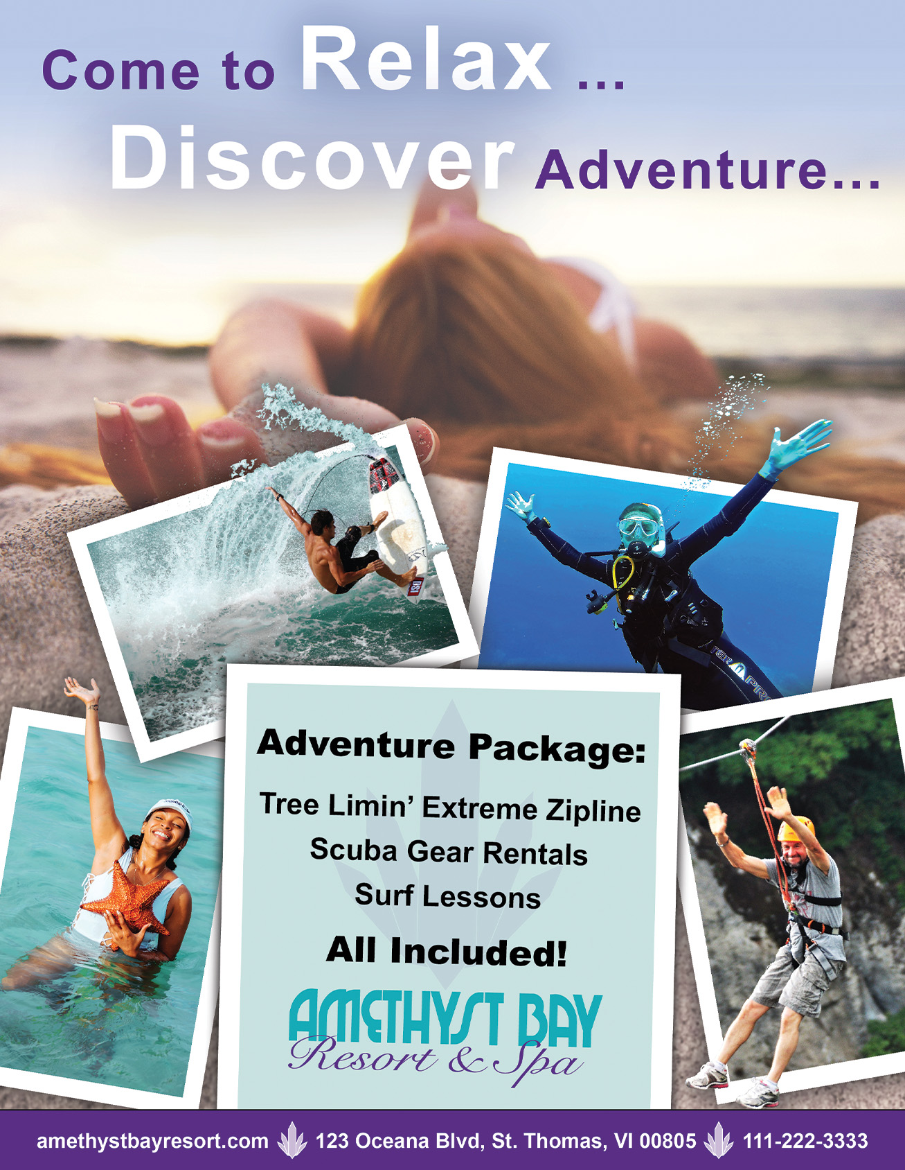
This was part of a project to create a magazine and companion web banner ad to promote Amethyst Bay Resort’s new Adventure Package. Utilizing their logo and company colors we created an ad that portrays both sides of the resort’s appeal, showing that you can always relax on the beach but the Virgin Islands has so much more to offer.
Amethyst Bay:
Animated Web Ad
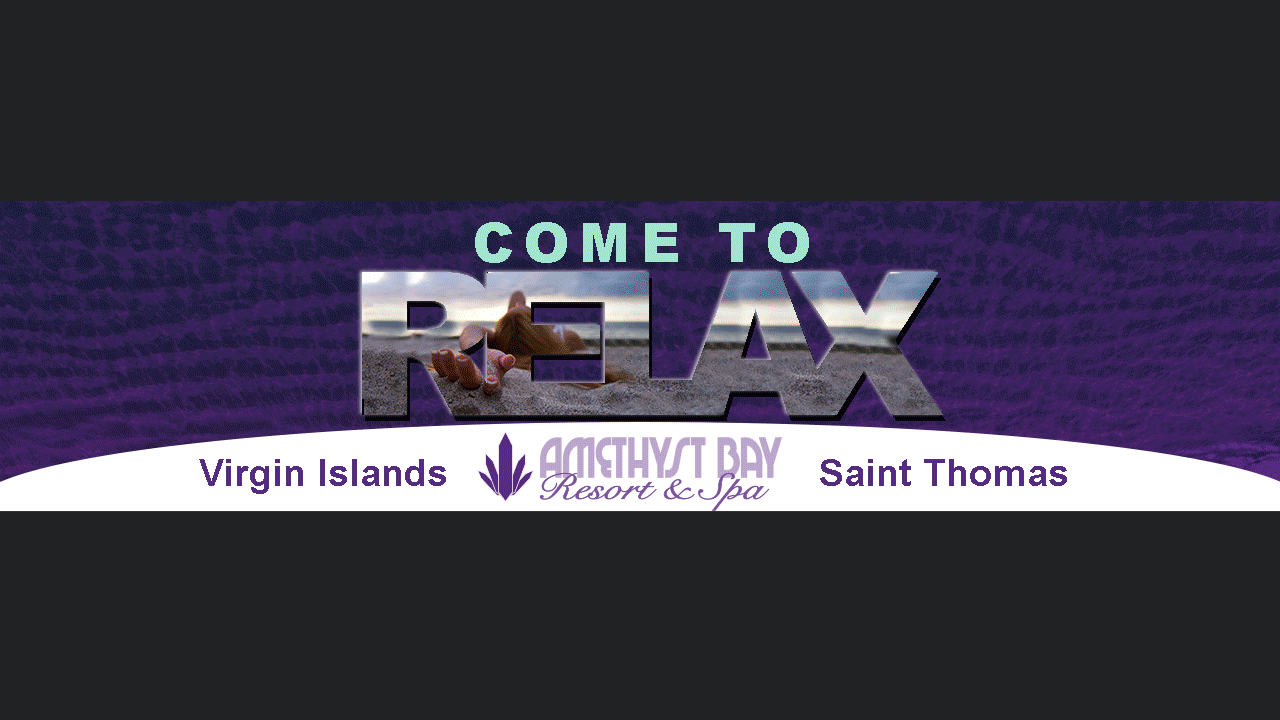
This was part of a project to create a magazine and companion web banner ad to promote Amethyst Bay Resort’s new Adventure Package. Utilizing their logo and company colors we created an ad that portrays both sides of the resort’s appeal, showing that you can always relax on the beach but the Virgin Islands has so much more to offer.
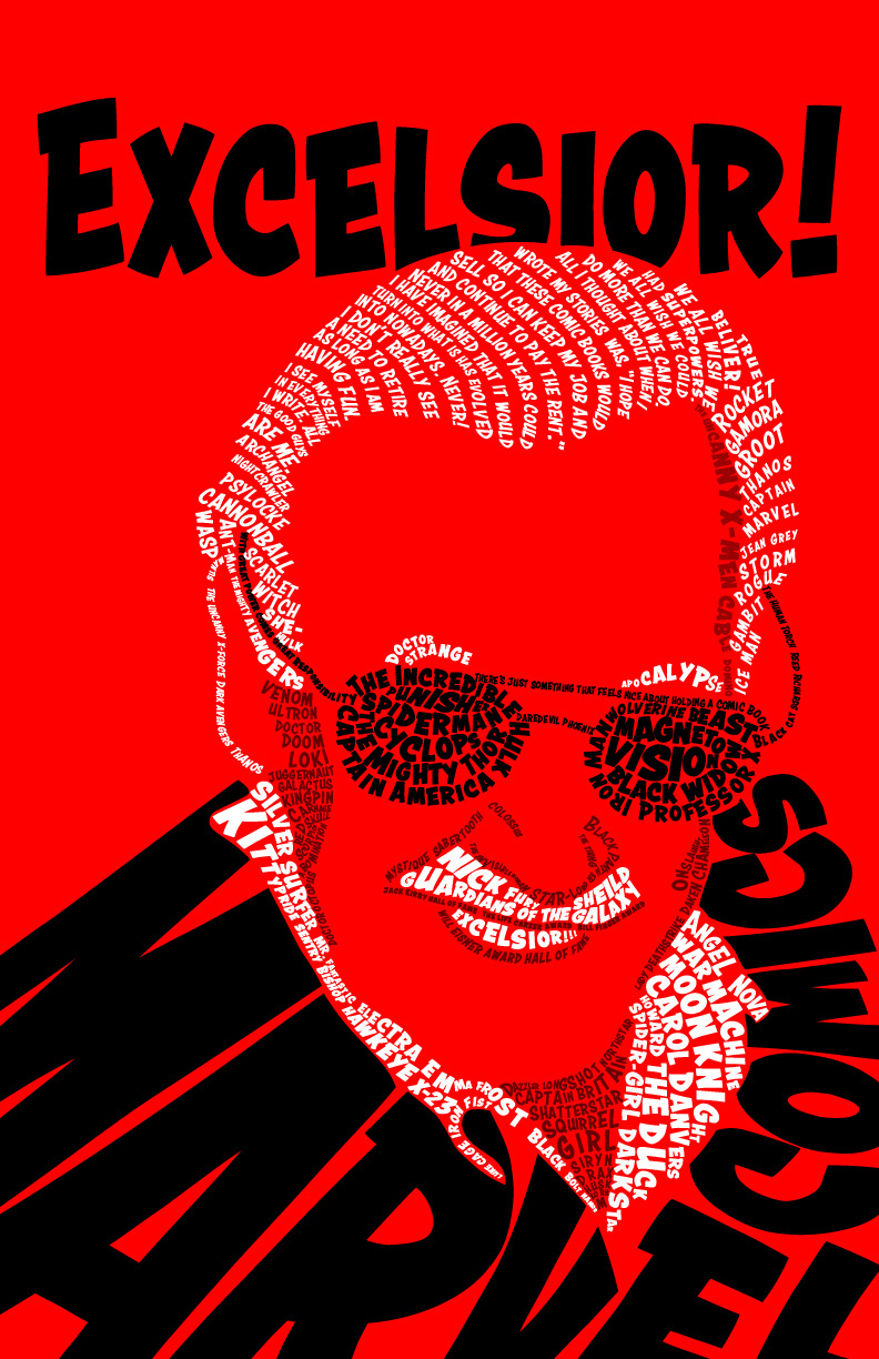
Excelsior!:
Book Cover

The Stan Lee Book cover was a fun piece to make. The illustration itself in made up of typography, using the font Blambot, a comic style font. It is made with a limited color palette and the words are characters that he and Marvel Comics created, or quotes spoken by Stan Lee.
Gamezine:
Magazine Cover
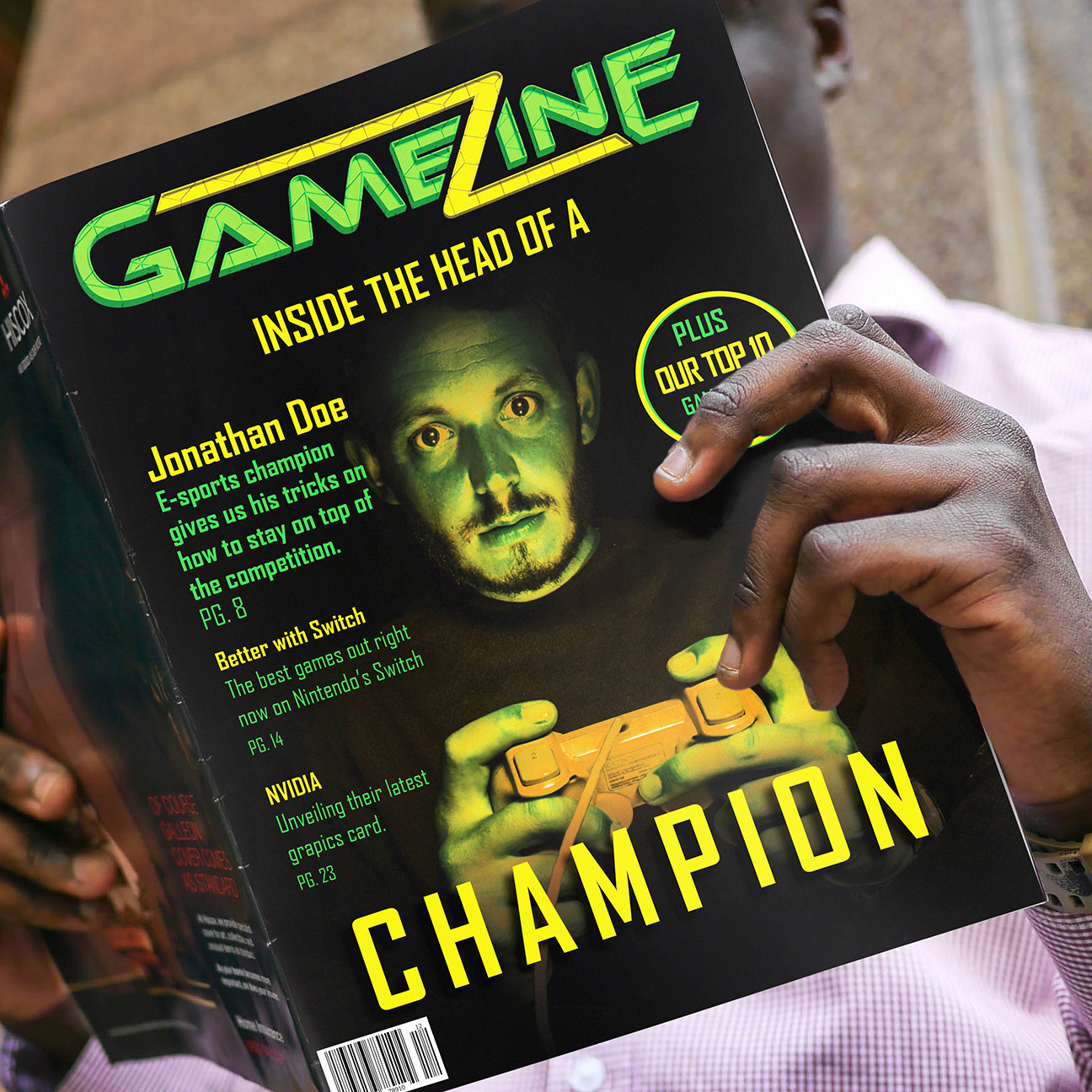
The Gamezine magazine cover was a project to create a cover design for a gaming publication. Everything about this cover was created by us, the color scheme, the chosen fonts, and the custom masthead.
Darkwood:
Movie Poster
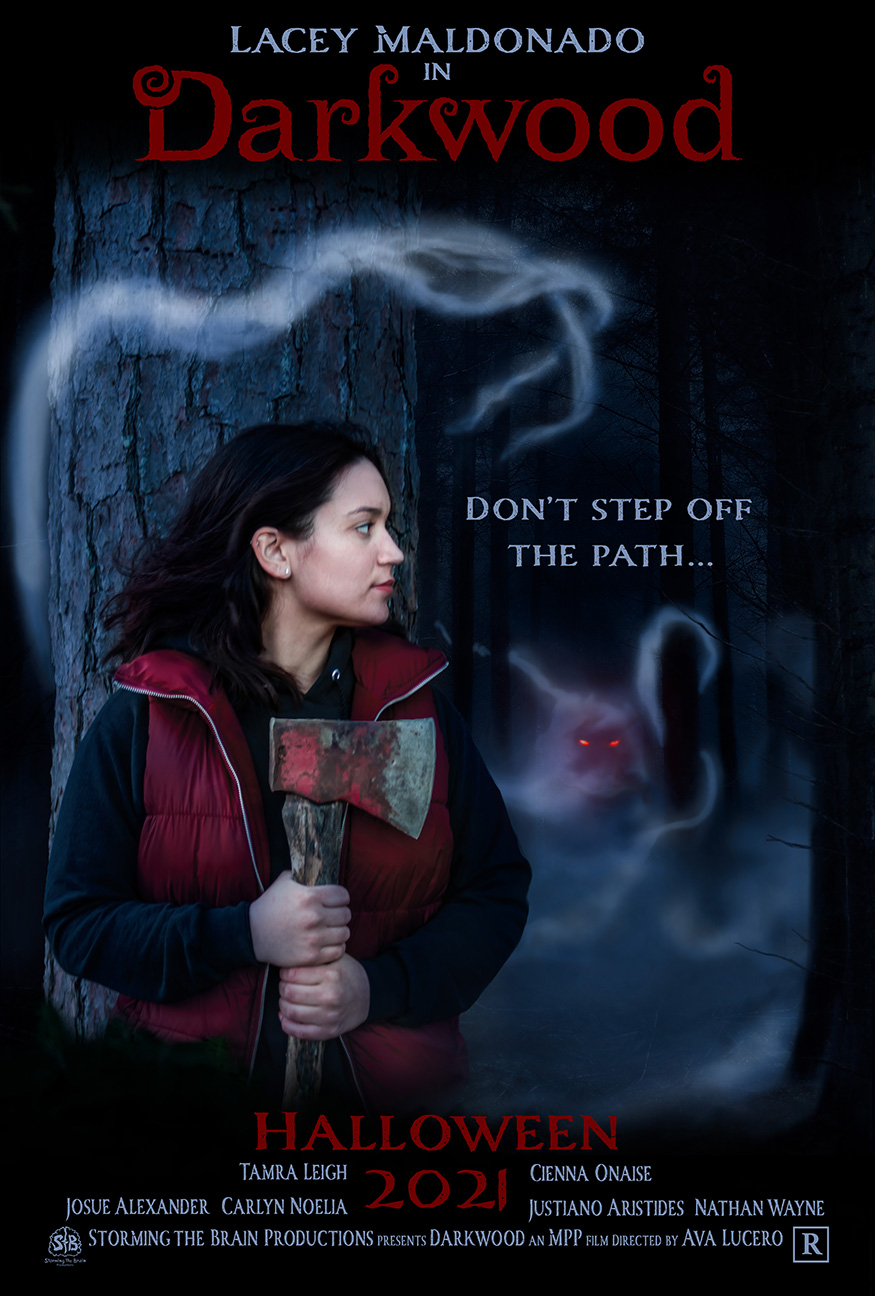
The Darkwood movie poster is a personal project for me. It is meant to be in a series of just your average people, that I take photos of and put them into a movie poster, of a genre of their choosing. Together, we come up with a theme, I choose the typography, and do all the photo compositing, and the credits are people that are important to that person’s life.
Logos:
Various Clients
Cocktail Cove is a hangout spot, on Lake Anna here in Virginia, as is The Sandbar. Harper Electric is a local electrical contractor. Altered State Arts is company under development that promotes experiential art and artists. One thing these all have in common is my love of incorporating fonts into designs.
Trailblazer Tea:
Can Design
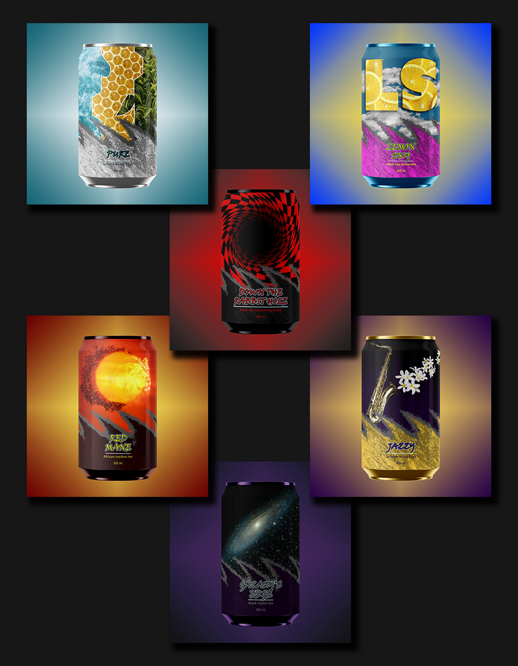
The Trailblazer Tea series is packaging design for a variety of canned teas. We had to come up with a unifying theme, which is what we did at the bottom of the cans, but something that gave them an “edgy” feel. Then we were allowed free reign to create artwork with the rest of the can, as long as it tied back to the type of tea in some way.
Viking Boat Game Asset:
Social Media Posts
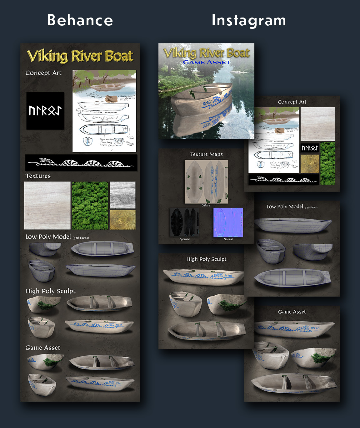
Both the 3D assets and the differing social media presentations were created by us. Maya was to create a low and high poly sculpt, then we baked the high poly details onto the low poly model to create a came ready asset. We created social media posts to present them, tailoring the formats to each platform’s unique ways of displaying them.